


We were tasked with executing a rapid re-design and development for the US Sennheiser site. Leveraging client research and after performing our own high level UX audit we identified the need to streamline and enhance the customer journey from the homepage through to the product detail page.
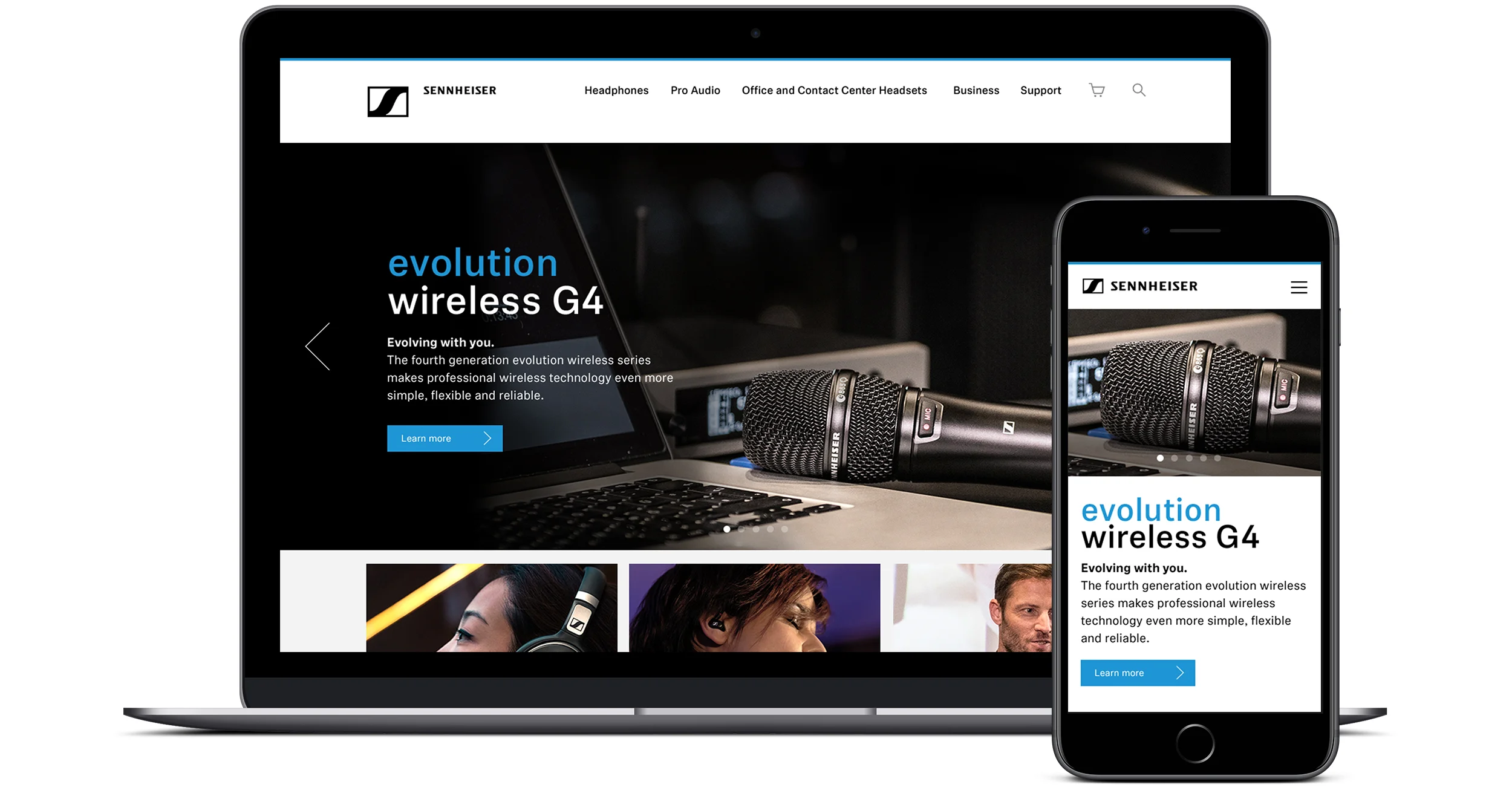
Our research identified the need for users to have a design structure that would support multiple modes of shopping (consumer vs. professional) and interacting with the brand. Starting with the global Sennheiser homepage we simplified the navigation and content for users to take either a consumer or professional path. Additionally we reinforced Sennheiser’s legacy and expertise by bringing forward “The Future of Audio” partnership campaign.
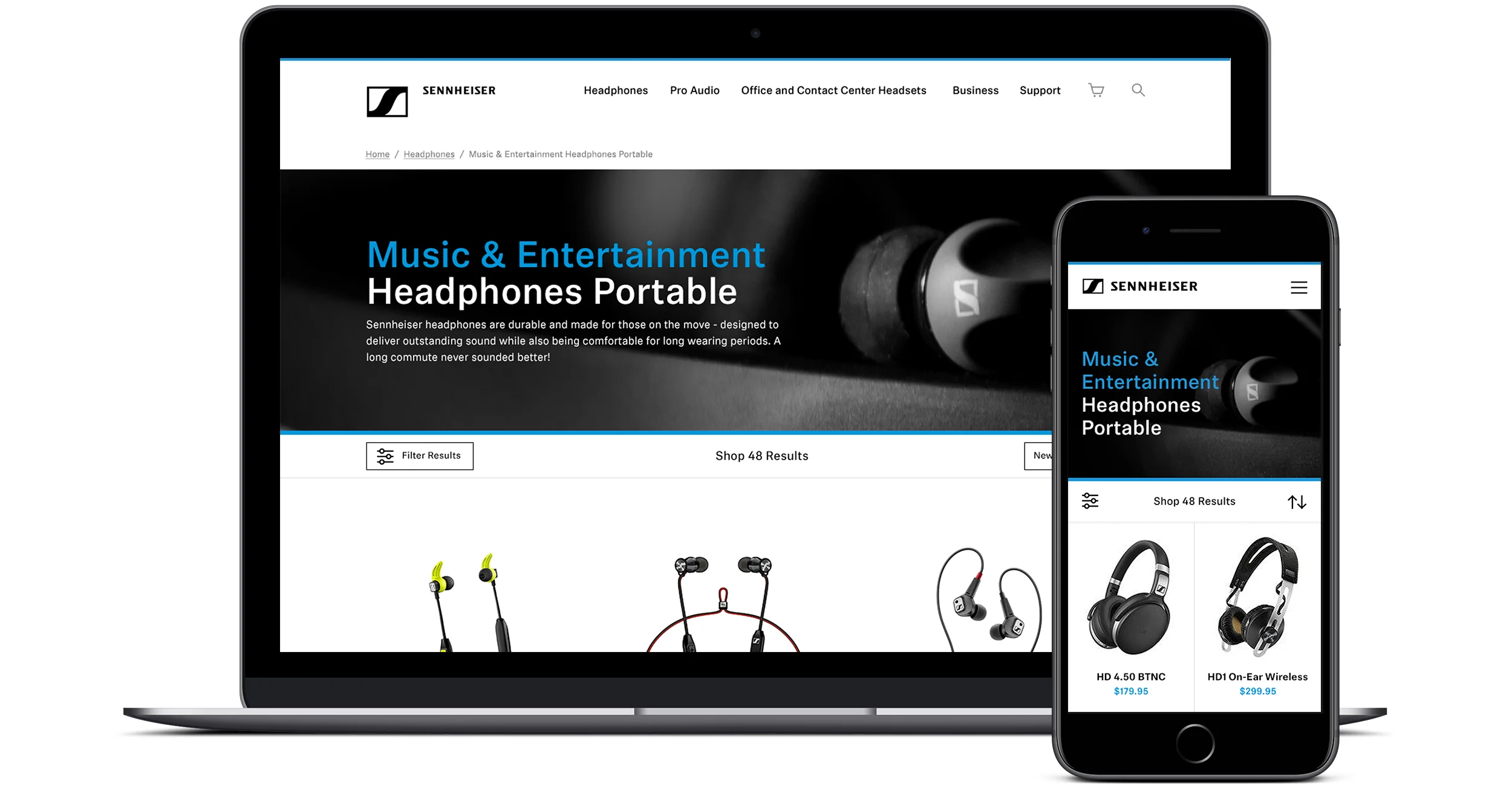
We found that users were having difficulty understanding the organization of the Shop homepage. In turn they were left guessing which path would most quickly show them their best buying options.
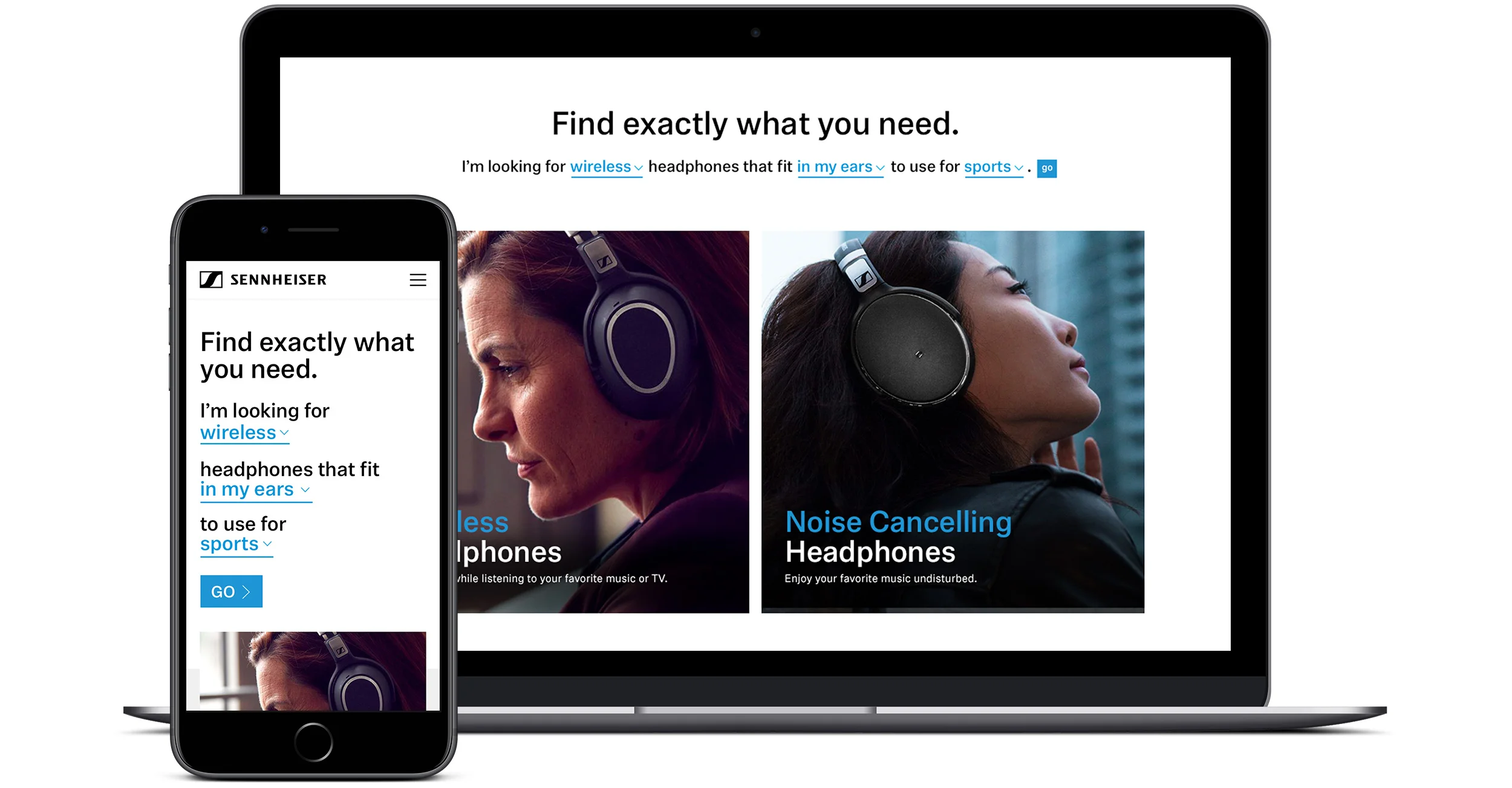
Data showed us that people first and foremost begin shopping for headphones by fit. Whether it was on ear, over ear, or in ear fit was the key driver in choosing headphones. We designed for easy to understand paths to move users along. We felt that we could take the experience a step further by leveraging a natural language filter. We focused the on three criteria:
1) Type of headphone fit.
2) Activity headphone’s will be used for.
3) Preference of wired or wireless headphones..
These three simple filters seamlessly resulted in buyers being presented with as few as three options to choose from. Notably the last decision of price would often lead to a single option.
There was a great deal of detailed information on the listing pages, causing the products to be driven further down screen at the expense of the size and quality of product images. We greatly reduced the information for each product down to the two key drivers that we know inform users decision of fit and connection. We were able to double the size of product photos while rolling up the filters into a optionally open drawer.
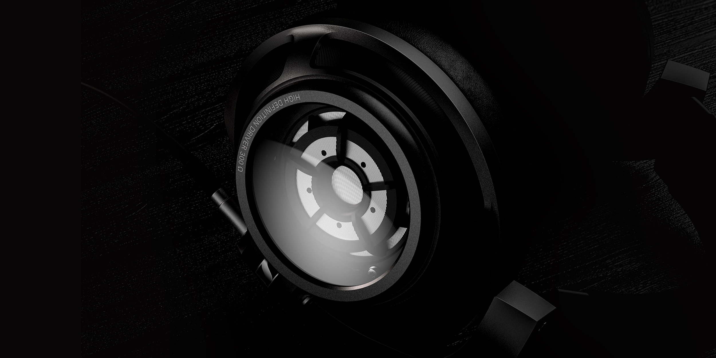
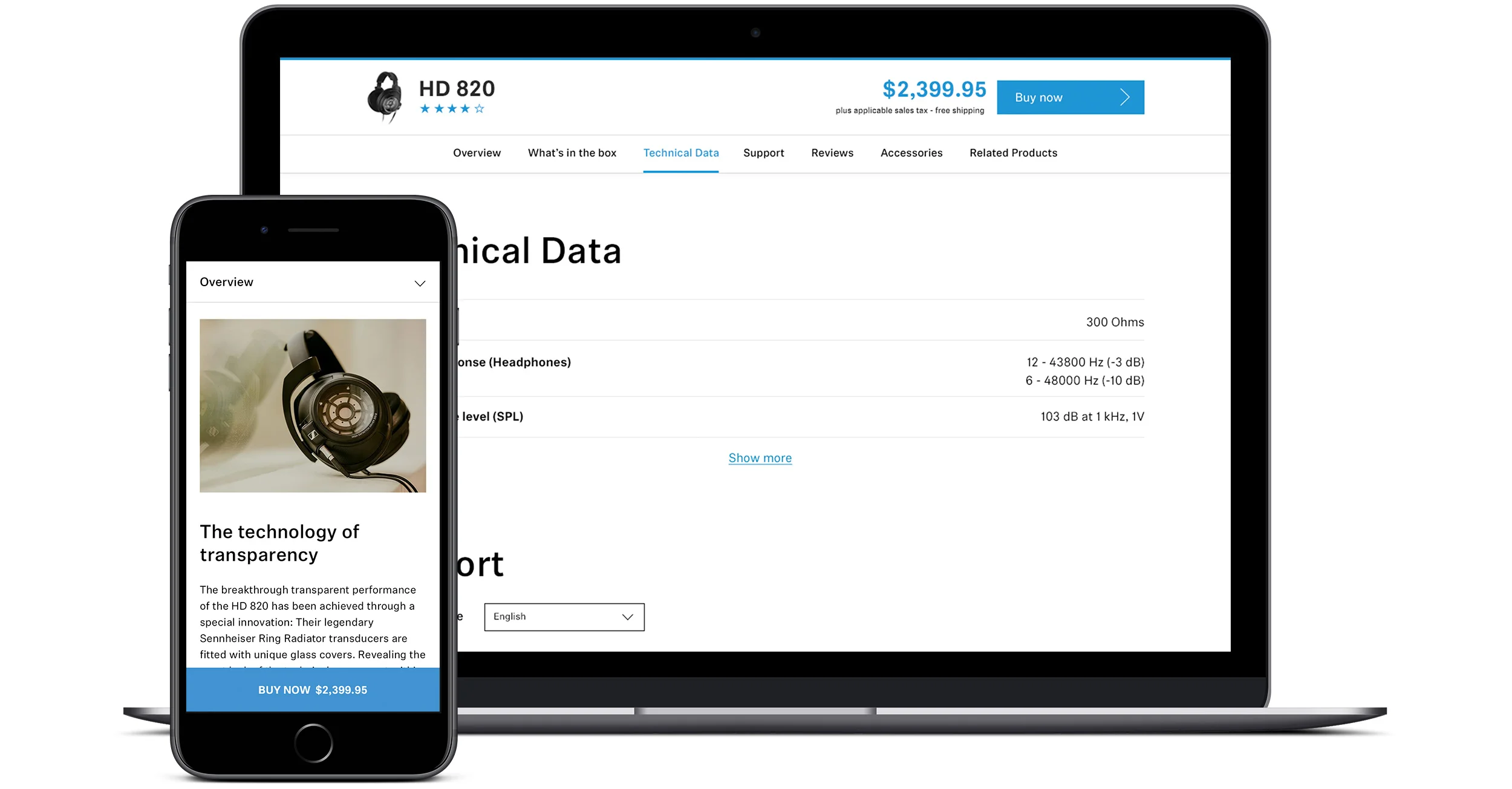
Sennheiser customer are audiophiles first and foremost they really want to geek out on product specs and have the ability to compare and contrast products. Unfortunately the design of the product detail pages wasn’t supporting very dense information very well.
We were able to make a few tactical UX changes to the existing framework to facilitate detailed research while also heightening the ability to purchase.
The following design changes were made resulting in an immediate increase of users proceeding with purchases added to the cart.
1) Implemented “anchored tabs” allowing users to jump to specific sections of product information.
2) Created a mini product view anchored to the top of the browser.
3) Changed the naming and behavior of the “buy now” button to say “add to cart”. As a result users may add items easily to the cart without leaving the shopping experience.